01 / Flagship case
Adservice · Connected B2B platform ecosystem
One system. Two sides of the market.
Redesigning data-heavy enterprise tools for approximately 1,400 publishers and 500 advertisers while building an organisation-wide design system.
Project overview
A fragmented product suite needed one clear direction.
Adservice operated several connected enterprise applications used by publishers, advertisers, brands, and internal teams across multiple European markets.
The existing interfaces had become outdated and inconsistent. The Publisher Interface contained large amounts of campaign and performance data but was difficult to navigate. An earlier attempt to replace the Client Interface had stalled, leaving advertisers without the modern self-service experience the company wanted to provide.
I led the user experience and interface design across all three enterprise products. This case focuses on the two main customer-facing applications and the design system connecting them.
My responsibility
I owned the work from initial problem framing through wireframes, interface design, reusable components, responsive behaviour, and implementation decisions. I also built the organisation’s complete Figma design system.
The design challenge
Clarity without removing the detail professionals rely on.
Publishers needed campaign information, statistics, search queries, and performance data. Advertisers needed to monitor spend and conversions while managing campaigns, approvals, commission structures, finance, and invoicing.
Instead of reducing useful information, I focused on stronger hierarchy, predictable interaction patterns, and reusable components that made complex data easier to scan and act on.
Publisher redesign / evidence
A clearer starting point for a data-heavy day.
The original and redesigned dashboards show the information-hierarchy change. This is a visual comparison, not a measured usability result.
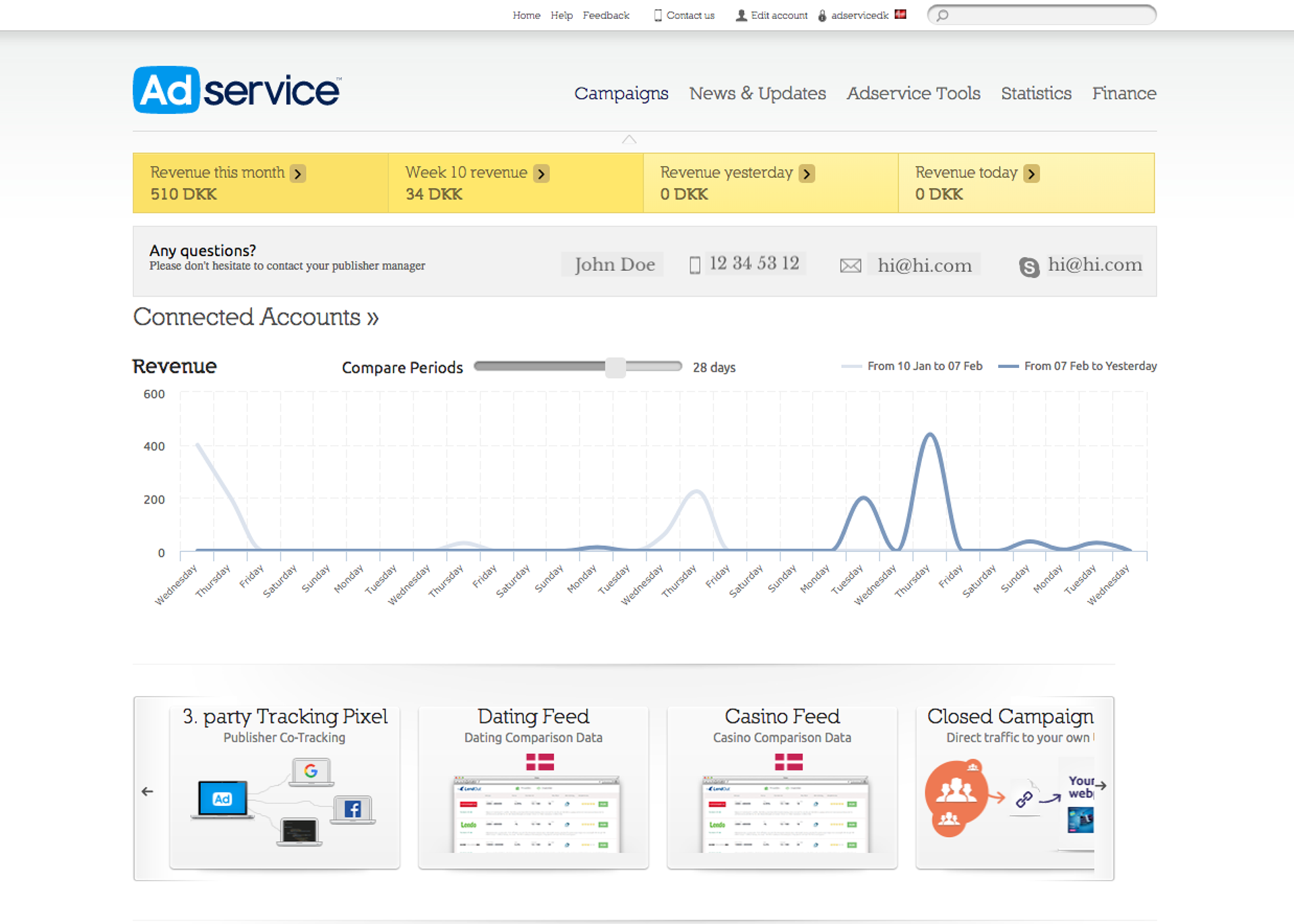
Useful data, competing priorities
Revenue, contact information, performance history and tools were all visible, but the page gave limited cues about what to review first or where to go next.
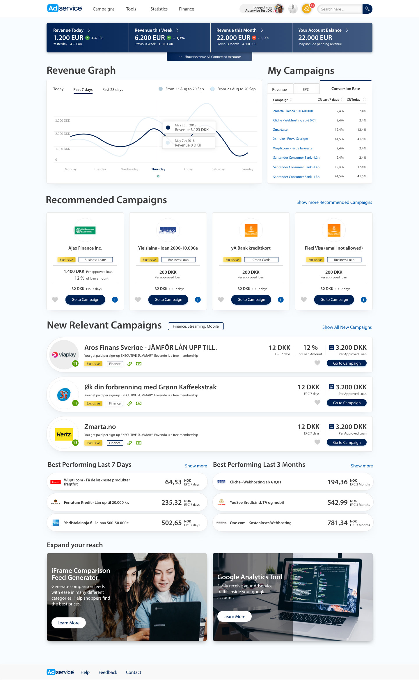
Overview first, depth on demand
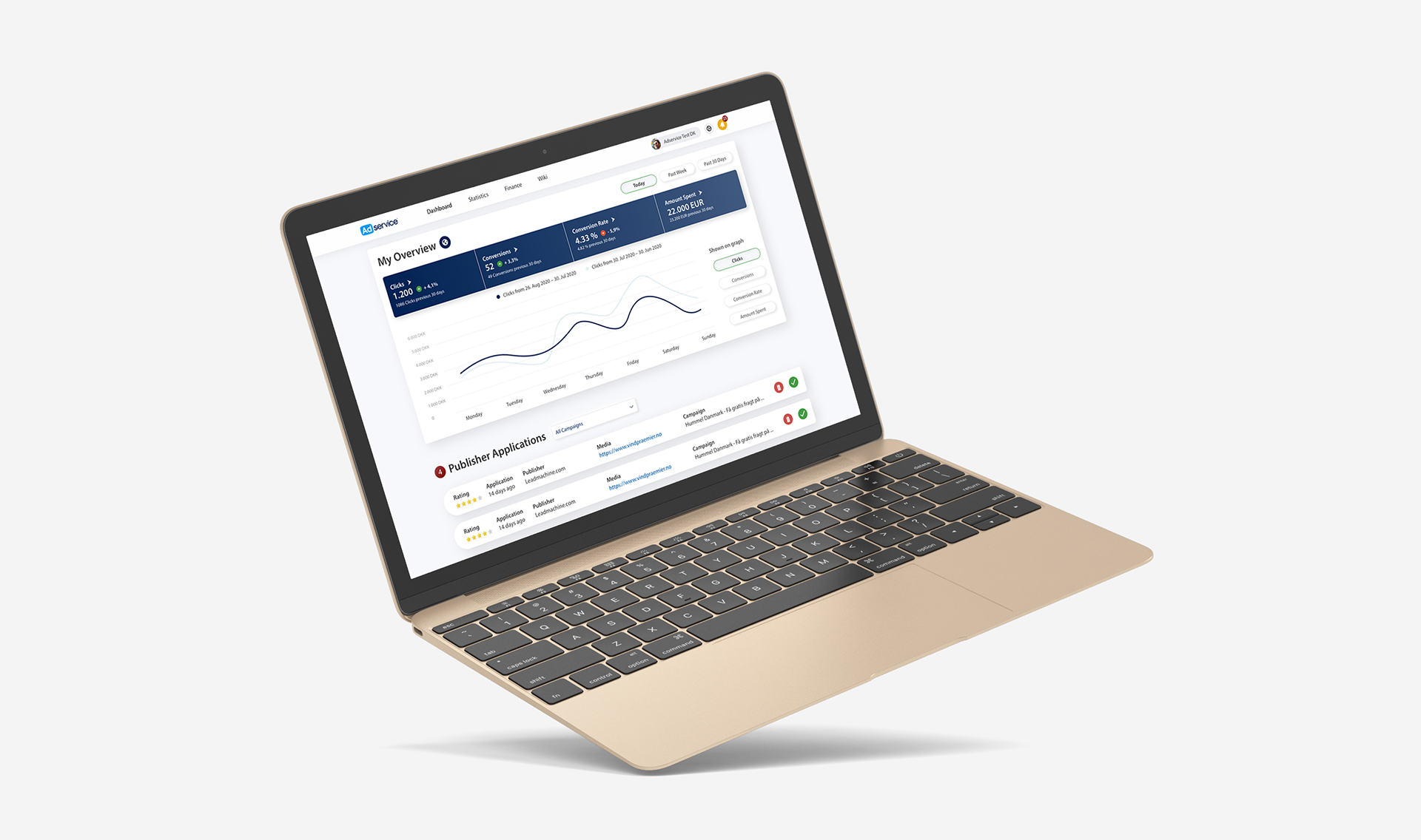
The redesign groups key revenue figures, comparison periods and campaign performance into distinct scan paths, while leaving detailed reporting and campaign tools available.
Leadership and country managers brought business goals and knowledge of publisher workflows.
Keep advanced functionality; improve hierarchy and repeatable interaction patterns instead of hiding data.
A denser interface remained necessary for experienced users, so clarity had to come from structure—not from removing useful information.
Two products
Shared foundations. Different jobs to be done.
The publisher redesign established the structure and visual language. The client platform then extended those lessons into a new product.
Publisher Interface
Dashboard, campaign discovery, advanced reporting, statistics, and promotional tools—responsive for performance checks on the move.
View original screen ↗Client Interface
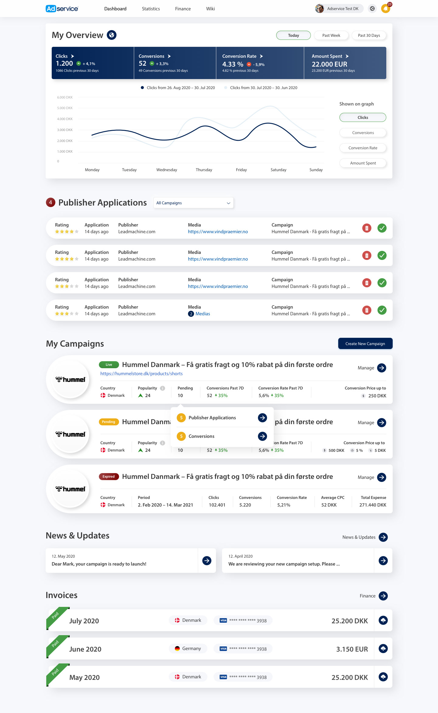
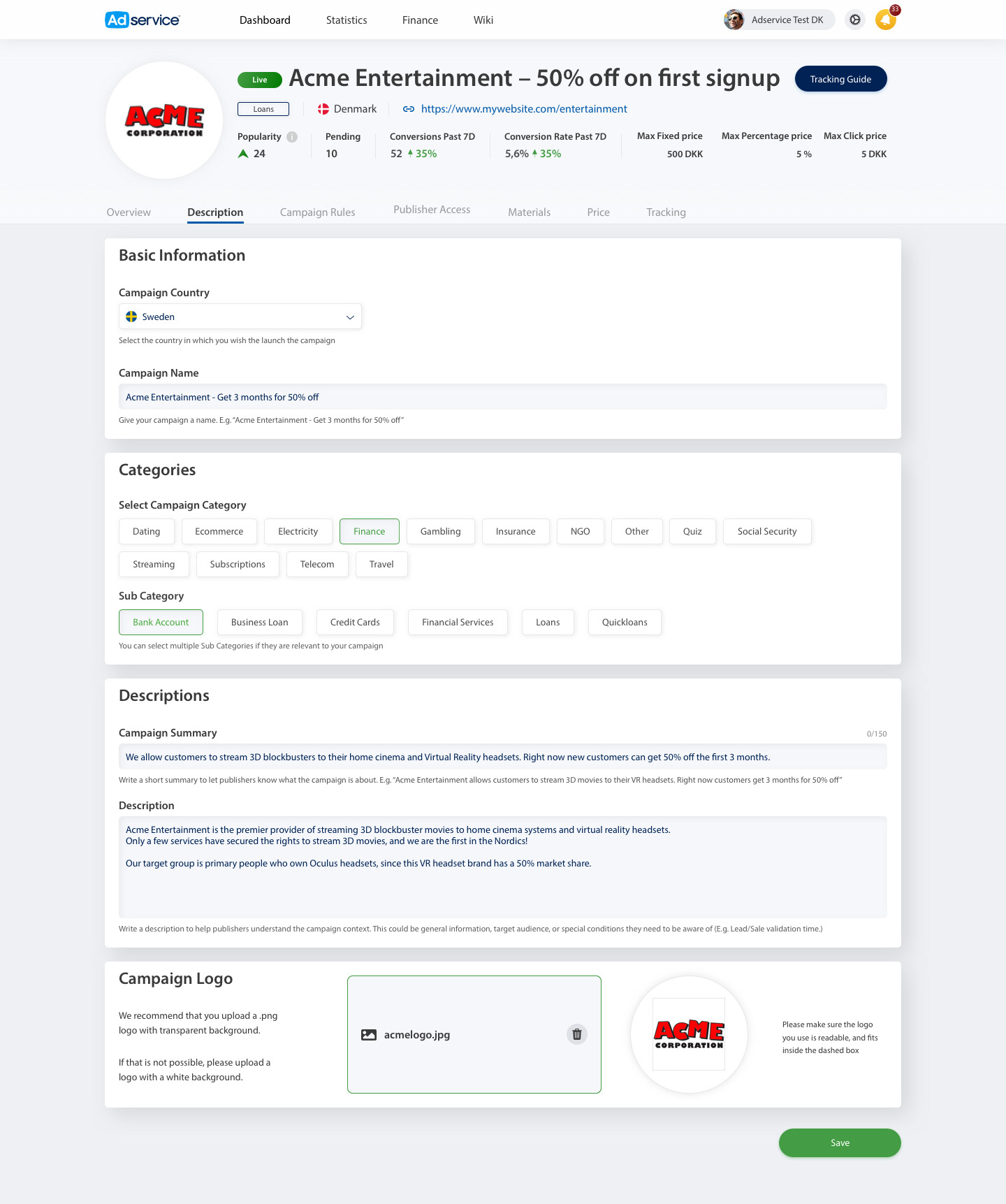
Designed from scratch for campaign performance, spend, conversions, publisher approvals, commission structures, finance, and invoicing.
 View original screen ↗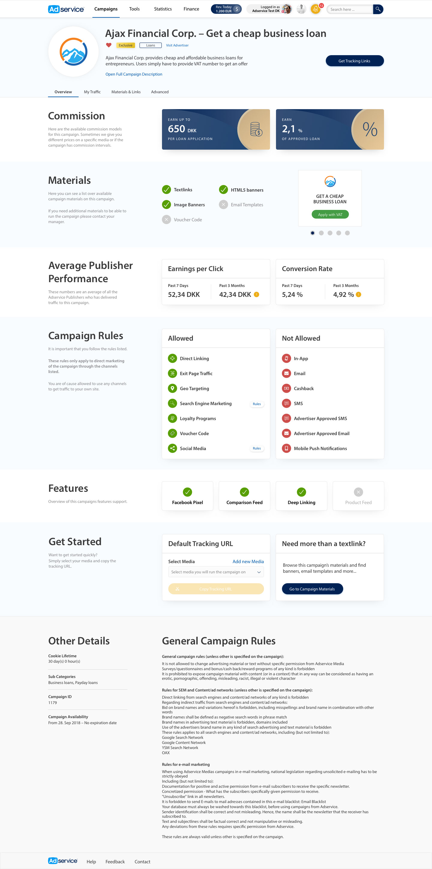
Client workflow / design decision
From performance monitoring to publisher action.
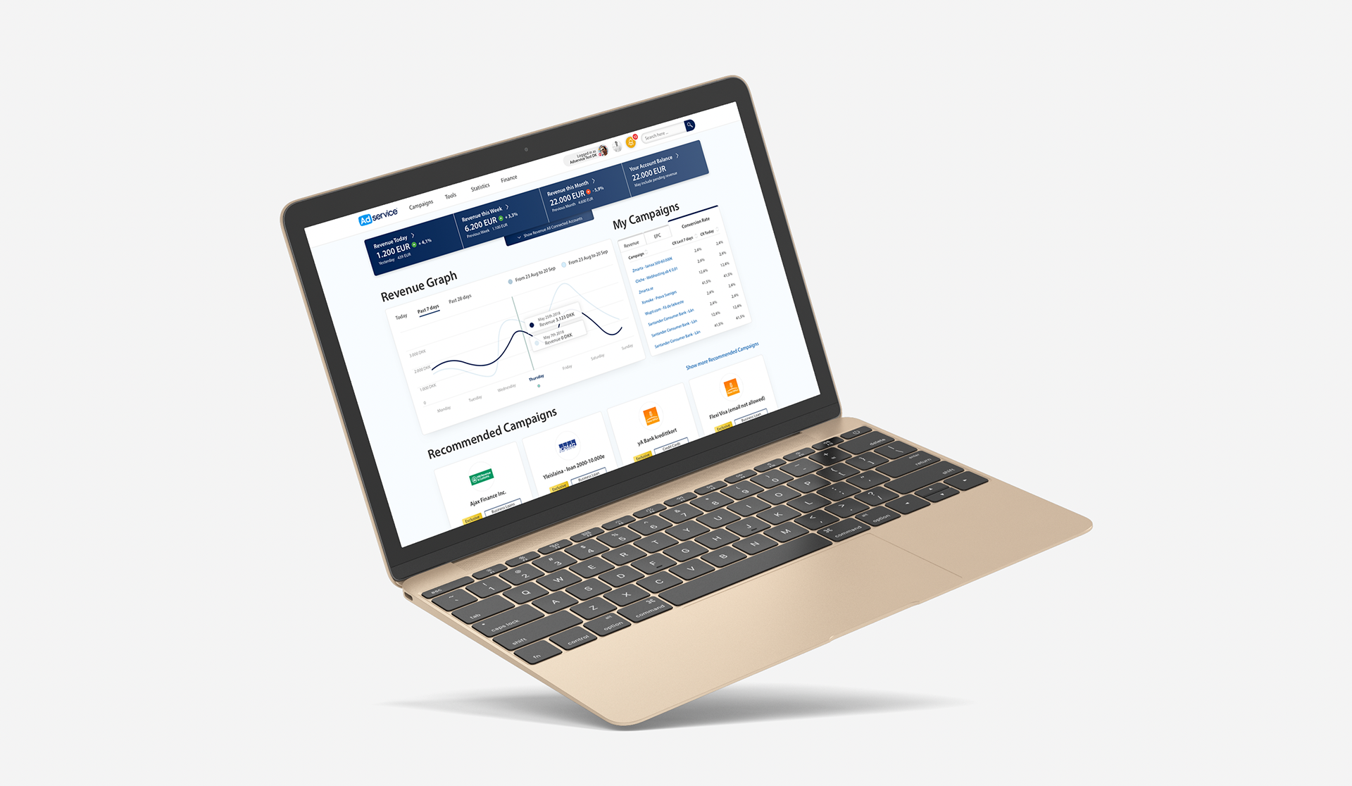
The Client Interface was designed from scratch for advertisers managing active campaigns. Its screens place reporting and operational work in the same product rather than treating analytics as a separate destination.
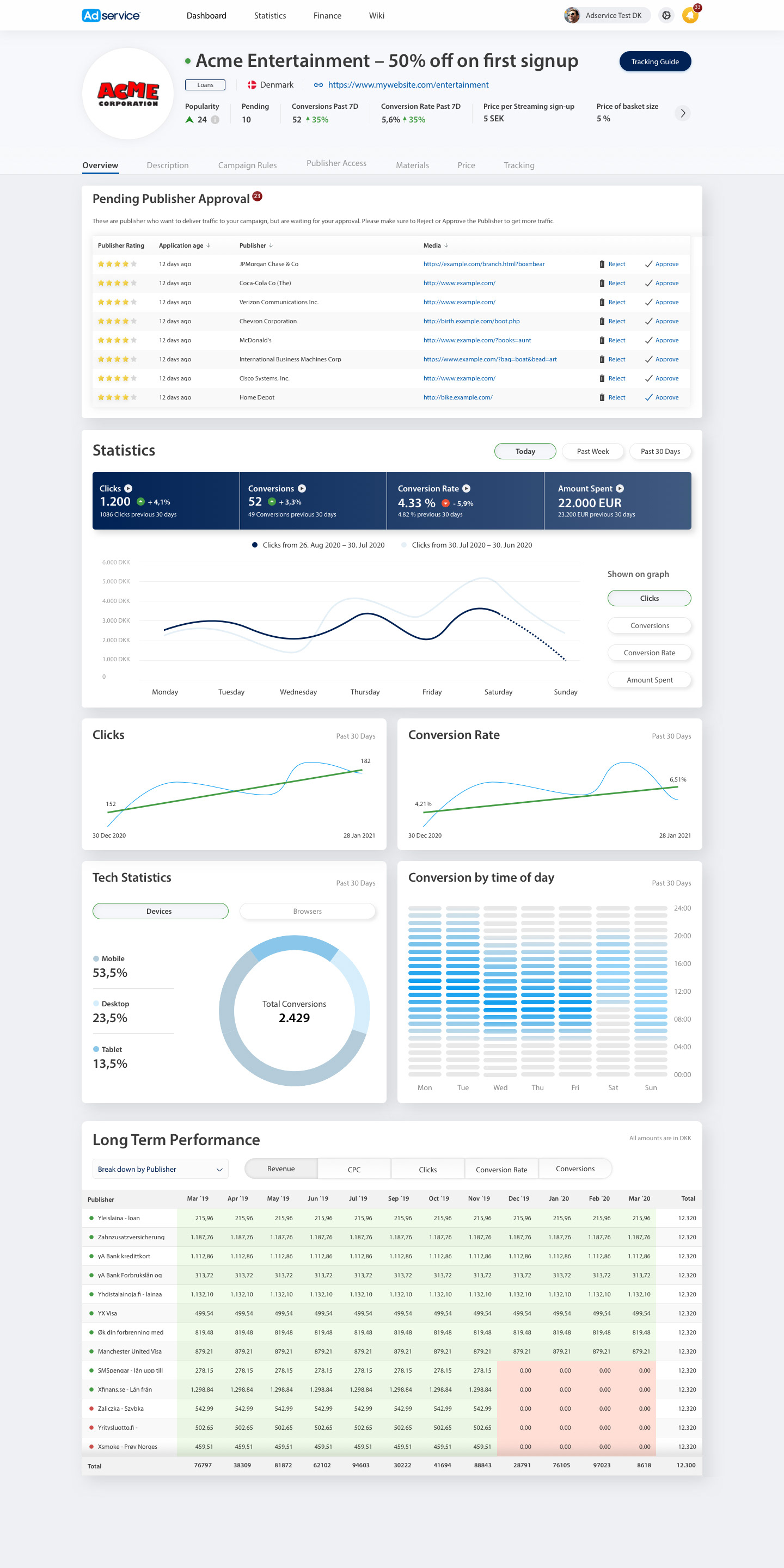
See the state of a campaign.
Advertisers needed to track spend and conversions alongside the publishers and pricing decisions affecting a live campaign.
Put status and action in context.
The campaign overview gives performance data a prominent place while keeping publisher applications and campaign controls close to the same working context.
Extend the product language.
I carried the Publisher redesign’s visual hierarchy and interaction patterns into Client, then added the approvals, campaign setup, finance and invoicing workflows that advertisers needed.
One design system
Consistency in the product, not just in a component sheet.
I built and expanded the Figma system across the enterprise suite. These original product screens show its shared visual language in use; the Figma source library is not displayed here.
Navigation, typographic hierarchy, cards, charts and data presentation follow a coherent language across the two products.
Publisher discovery and reporting remain distinct from advertiser approvals, campaign setup and finance.
Reusable Figma patterns gave new tools a starting point and helped keep iteration consistent across products.
Outcome
Two connected experiences with a coherent visual language.
The work delivered clearer navigation, responsive layouts, and reusable patterns across both sides of the platform. The system increased iteration speed and created a shared foundation for future products.
“The best affiliate agency interface in the market.”